mirror of
https://github.com/zhigang1992/react-native-popover-view.git
synced 2026-01-12 22:50:38 +08:00
b91cfeba570baadcee350a2afb0124984811d324
I copied the popover file from uk-agilityworks and modified it in the
same way as the other, looking for stability fixes.  Turns out, it was
the native driver causing the flickering, so turned that off.  Now
supports Android without crashing.
react-native-popover
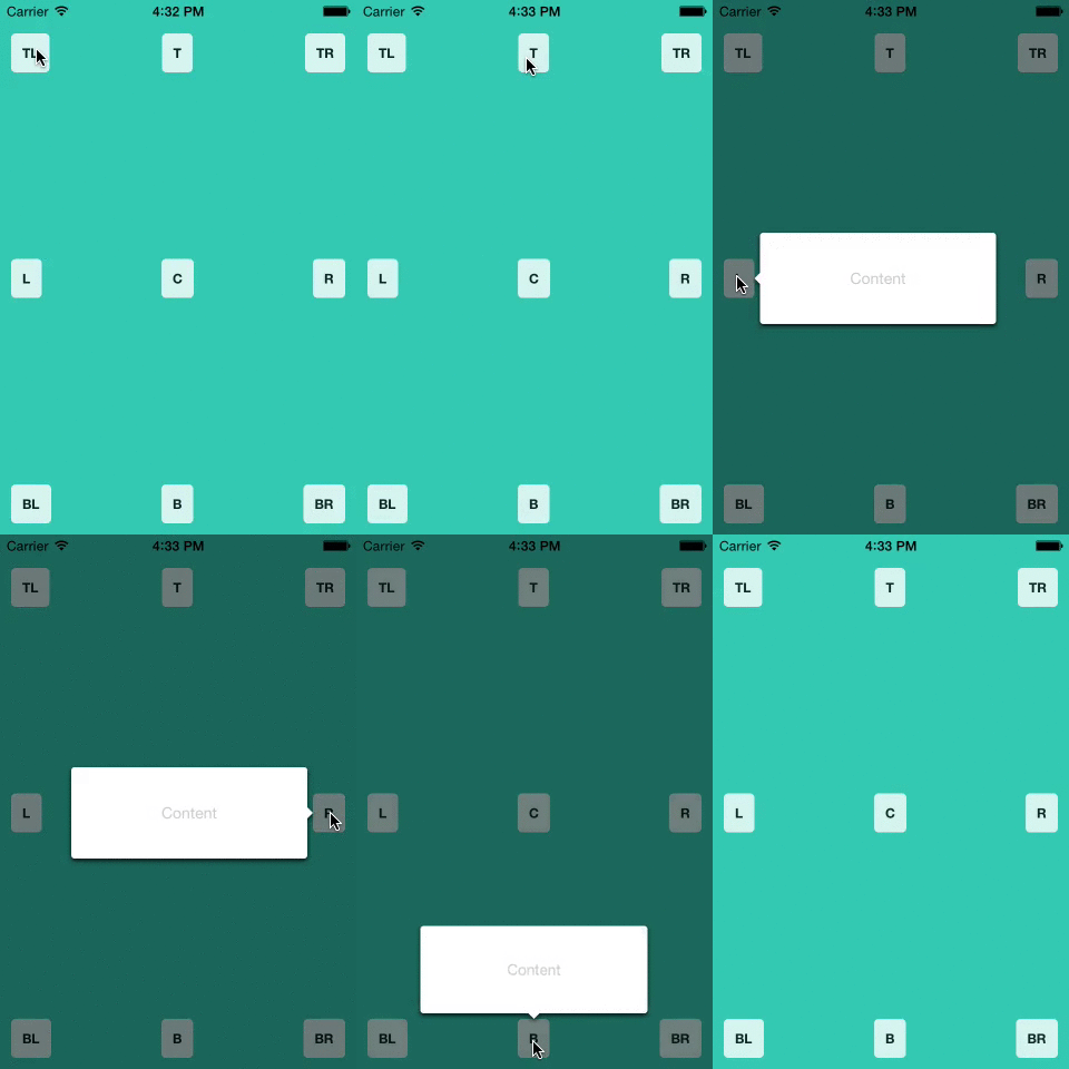
A <Popover> component for react-native. Great for use in Tablets; you can put entire views that you would normally show in a modal (on a smaller device) into a popover, optionally give it an anchor point, and have it float on top of all of the other views.
Install
npm i --save https://github.com/SteffeyDev/react-native-popover.git
or
yarn add https://github.com/SteffeyDev/react-native-popover.git --save
Usage
'use strict';

var React = require('react');
var Popover = require('react-native-popover');
var {
  AppRegistry,
  StyleSheet,
  Text,
  TouchableHighlight,
  View,
} = require('react-native');

var PopoverExample = React.createClass({
  getInitialState() {
    return {
      isVisible: false,
      buttonRect: {},
    };
  },

  showPopover() {
    this.refs.button.measure((ox, oy, width, height, px, py) => {
      this.setState({
        isVisible: true,
        buttonRect: {x: px, y: py, width: width, height: height}
      });
    });
  },

  closePopover() {
    this.setState({isVisible: false});
  },

  render() {
    return (
      <View style={styles.container}>
        <TouchableHighlight ref='button' style={styles.button} onPress={this.showPopover}>
          <Text style={styles.buttonText}>Press me</Text>
        </TouchableHighlight>

        <Popover
          isVisible={this.state.isVisible}
          fromRect={this.state.buttonRect}
          onClose={this.closePopover}>
          <Text>I'm the content of this popover!</Text>
        </Popover>
      </View>
    );
  }
});

var styles = StyleSheet.create({
  container: {
    flex: 1,
    alignItems: 'center',
    justifyContent: 'center',
    backgroundColor: 'rgb(43, 186, 180)',
  },
  button: {
    borderRadius: 4,
    padding: 10,
    marginLeft: 10,
    marginRight: 10,
    backgroundColor: '#ccc',
    borderColor: '#333',
    borderWidth: 1,
  },
  buttonText: {
  }
});

AppRegistry.registerComponent('PopoverExample', () => PopoverExample);
Props
| Prop | Type | Optional | Default | Description |
|---|---|---|---|---|
| isVisible | bool | Yes | false | Show/Hide the popover |
| fromRect | rect | Yes | {} | Rectangle at which to anchor the popover. If not provided, the popover will appear in the center of the screen. |
| displayArea | rect | Yes | screen rect | Area where the popover is allowed to be displayed |
| placement | string | Yes | 'auto' | How to position the popover - top | bottom | left | right | auto. When 'auto' is specified, it will determine the ideal placement so that the popover is fully visible within displayArea. |
| onClose | function | Yes | Callback to be fired when the user taps the popover | |
| customShowHandler | function | Yes | Custom show animation handler - uses a react-tween-state wrapper API in order to show the modal. See default show handler. | |
| customHideHandler | function | Yes | Custom hide animation handler - uses a react-tween-state wrapper API in order to hide the modal. See default hide handler. |
rect is an object with the following properties: {x: number, y: number, width: number, height: number}
Credits
The code supporting animations was inspired and adapted from @brentvatne's Transition.js mixin.
MIT Licensed
Description
Languages
JavaScript
90%
Objective-C
10%


